


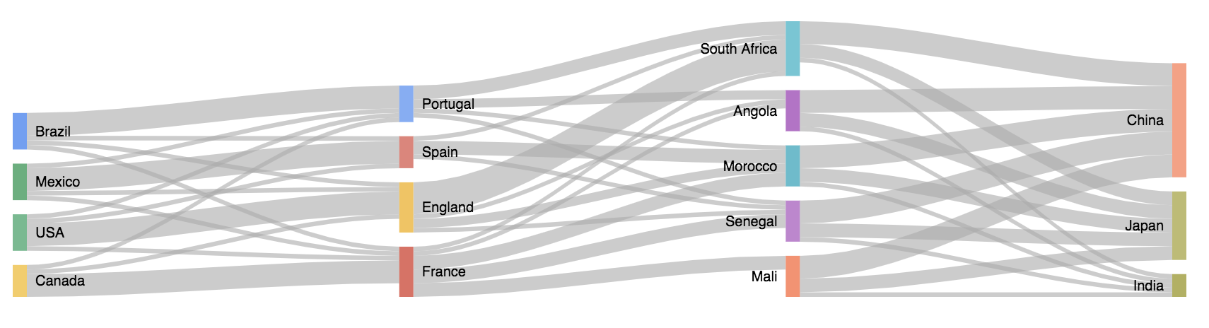
Example of a Sankey chart in Dataiku DSS.
Plugin information
| Version | 0.1.1 |
|---|---|
| Author | Dataiku (Joachim ZENTICI, Du PHAN) |
| Released | 2019-11-11 |
| Last updated | 2019-11-11 |
| License | MIT License |
| Source code | Github |
| Reporting issues | Github |
Description
Sankey charts are used when you want to show a n-to-n mapping between two entities (e.g., countries and continents) or paths through several states (customer journey in an e-commerce website). The arrow widths are proportional to the flow’s volume. The entities/states are usually represented in layers.
Installation Notes
The plugin can be installed from the Plugin Store or via the zip download (see above).
Reminder: A custom chart is an additional way to visualize information about a dataset, custom charts appear in the ‘other’ set of charts on a dataset.
Components
Static Sankey
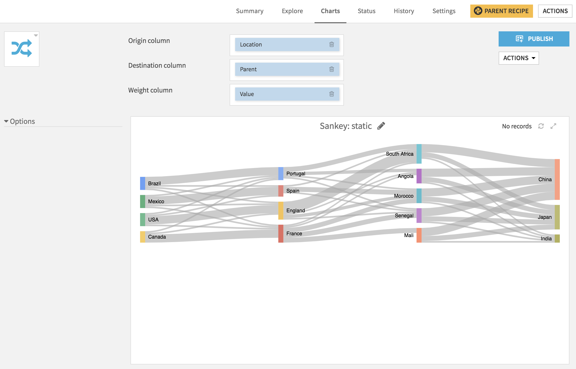
No processing is done on the data, states are rendered using weighted arrows.
Browsable Sankey
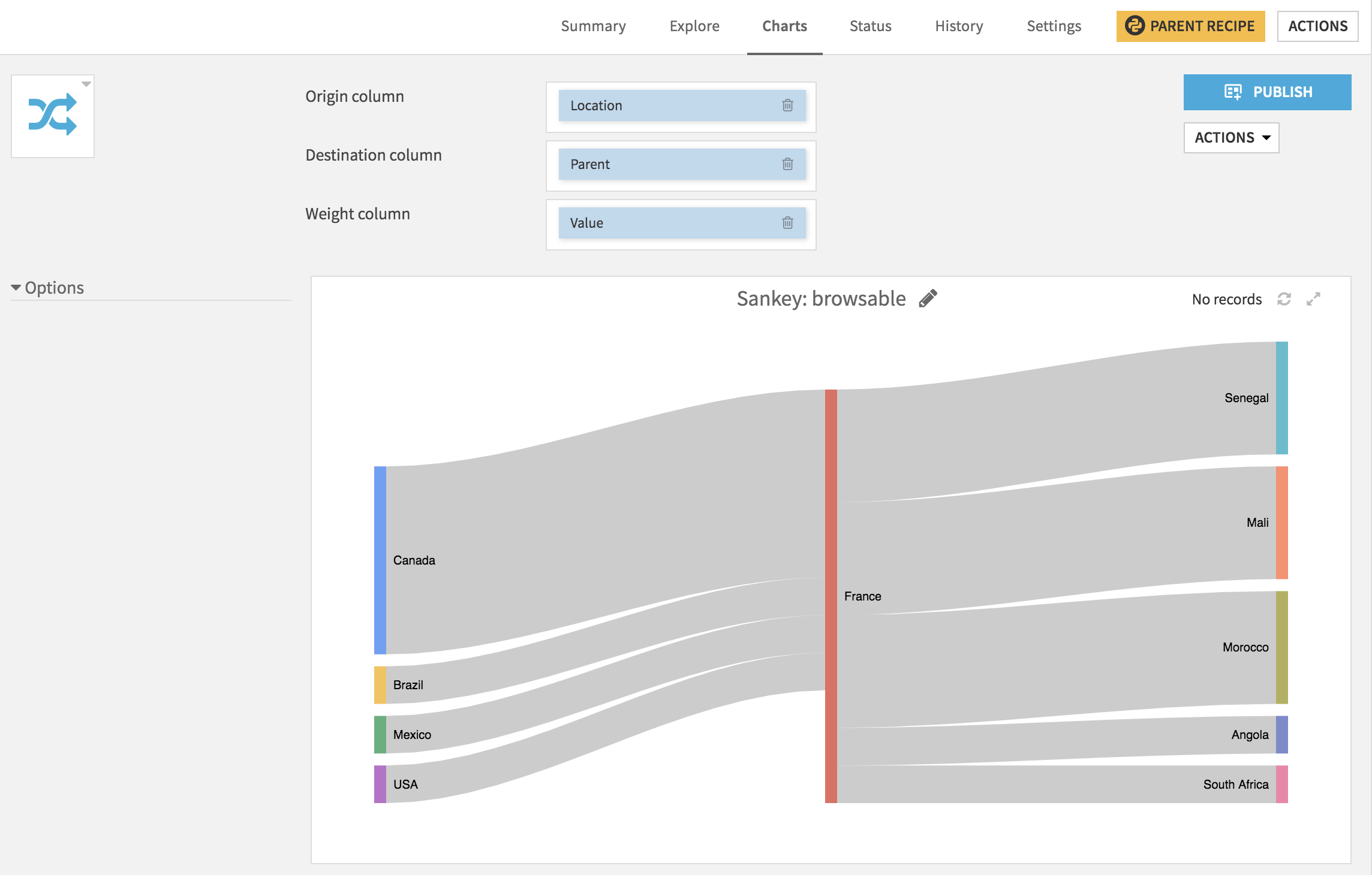
This Sankey chart focuses the reprentation on a specific state and only renders the predecessors the successors. If a state is both a predecessor and a successor, it is considered as two distinct nodes (no cycles are possible; they are often not interesting in the case of flow visualization).
In this mode, the sankey chart is browsable: you can click on any predecessor or sucessor and it will re-render the chart with this state as the central node.
This mode is particularly suited for large sankey graphs or cyclic ones.